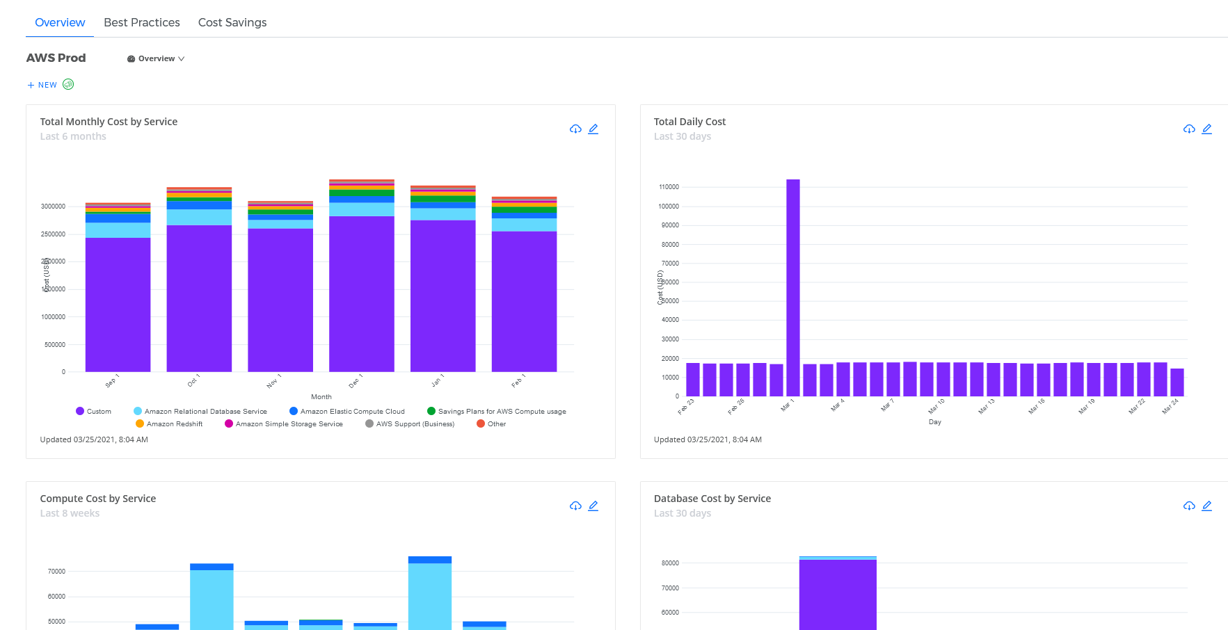
CMx dashboards allow you to examine your cloud data from every angle and drill into that data, which helps you answer questions like, "How much money am I spending on a cloud service in a particular data center region?". CMx Dashboard Panes allow you to create user-friendly visual summaries for you and your users.
Prerequisites
You must ensure that your permission set includes the following permissions:
view cost summary reports
manage dashboards
If you only want a user to view data, you will only need the view cost summary reports permission.
If you wish to view the Profit Analysis Pane type, you must possess view actual cost and view list cost permissions.
Any CloudCheckr CMx customer or cloud vendor, regardless of account type, can create a CloudCheckr CMx dashboard pane within the Overview Dashboard.
Launch CloudCheckr CMx.
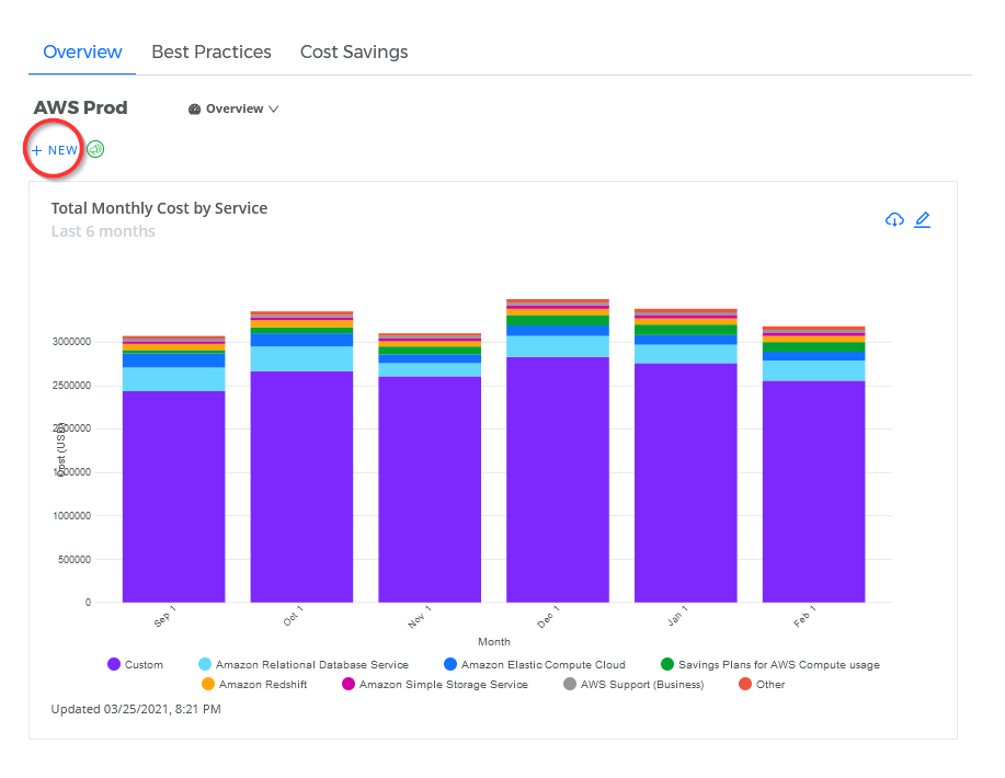
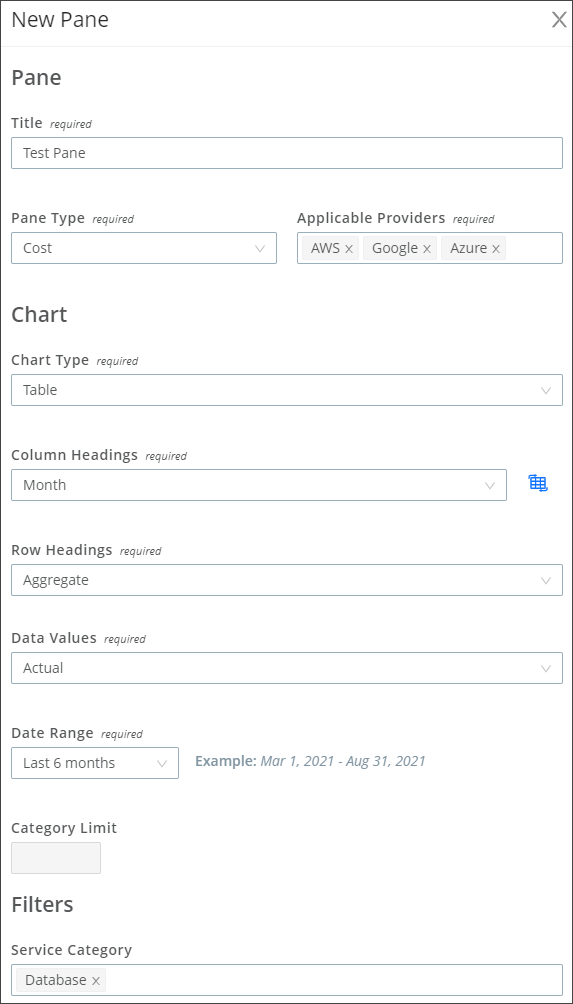
Click + NEW button on the left side of the Home page and select New Pane from the drop-down menu.A New Pane sub-drawer opens. The fields and settings available depend on the Chart Type you select.
Complete the required fields, at a minimum, and any optional fields you feel are needed for your dashboard pane. Click Fields to view a description of each field:
The type of pane you select will determine which data fields get displayed and which of those are required or optional.
Field
Purpose
Title
Type a name for the dashboard pane. CloudCheckr CMx will display it in the top-left corner.
Pane Type
From the Pane Type drop-down menu, select your pane type. Depending on the pane type, certain configuration options will be unavailable.
Applicable Providers
Click the Applicable Providers and select one or all the following cloud providers: AWS, Azure, or Google.
Chart Type
From the Chart Type drop-down menu, select one of the following chart formats:
Area - Stacked (the area between the axis and each line represents a data sub-category; each area is displayed in a different color and is stacked on top of another area)
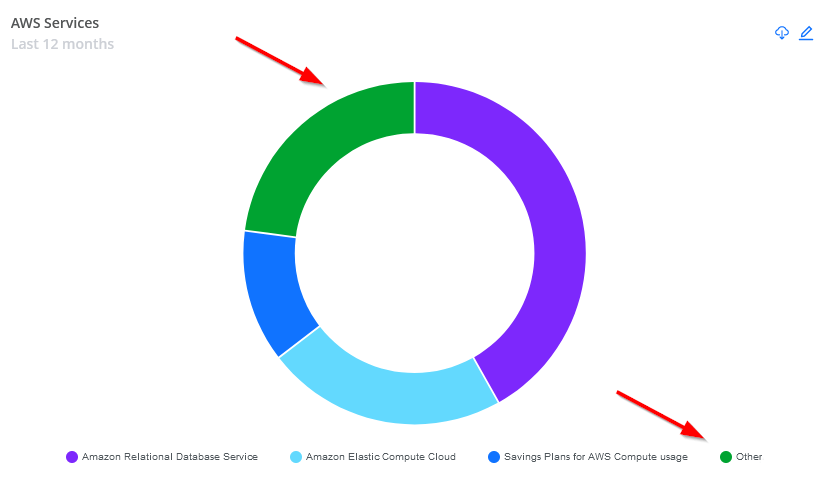
Donut (the size of each piece represents the proportion of a data category)
If the value of a category is equal to or less than zero, CloudCheckr CMx will group those categories as Other in the chart and in the legend. (See screenshot:)
Line - Series (displays information as a series of data points connected by straight line segments)
Table (displays your data in rows and columns to allow you to easily compare data points)
If you select Table, you won't be able to export the data to a .PNG format.
Vertical Bar - Stacked (each bar represents the value of a sub-category within a category; each sub-category is stacked on top of another bar vertically)
Vertical Bar - 100% Stacked (each bar represents a percentage of a sub-category within a category, so that the total of each sub-category equals 100)
Vertical Bar - Series (each bar represents the value of a selected category)
X-Axis
From the X-Axis drop-down menu, select a property to display on the x-axis of your graph.
Y-Axis
From the Y-Axis drop-down menu, select a cost type to display on the y-axis of your graph.
Column Headings
From the Column Headings drop-down menu, select the main data point on which to filter your table data. This data is represented in columns of your table.
You can click the Swap Rows and Columns button to flip the selections for Row and Column headings to display your data differently. (Table only)
Group By or Row Headings
From the Group By or Row Headings drop-down menu, select one of the following properties to further refine your data. This data is represented in the rows of your table.
You can click the Swap Rows and Columns button to flip the selections for Row and Column headings to display your data differently. (Table Only)
Aggregate: The total cost for the selected data.
Unique ID - Account-Friendly Name: The unique ID or account-friendly name (if available) of a CloudCheckr CMx account.
Service Category: a container for related services in CloudCheckr CMx.
Service: A cloud-based product designed to help you optimize your deployment.
Location: The geographic region where you want to focus your cost analysis.
Service Sub-Type: A sub-set of functions within a selected service.
Tag: A list of available Tag Keys to customize the data based on specific tags in your system.
Data Values
From the Date Values drop-down menu, select:
Actual: The raw values from your cloud provider.
List: The amount that CloudCheckr bills the customer based on usage and contractual charges. (Table only)
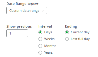
Date Range
From the Date Range drop-down menu, select one of the built-in date ranges or select a custom date range:
Category Limit
This field is only selectable if you chose a Group By property. Click the up or down arrows to select a number.
Category limit refers to the number of categories you want to be visible in the chart ordered by spend. CloudCheckr CMx will group all other categories by Other.
From the Service Category drop-down menu, select a service category from the list or select uncategorized if you don't want to filter by one of listed service categories. These are comprehensive lists, meaning a category might display even if there is currently not cost or usage data for the category.
Resource Tags
Filtering by Tag Key-Value combinations allows you to customize your Dashboard pane for specific information. From the Key drop-down menu, select a Tag Key from the list, and then select an associated Value. You can select the same Tag Key multiple times with different Values by clicking the New Key and Values button.
Click SAVE.
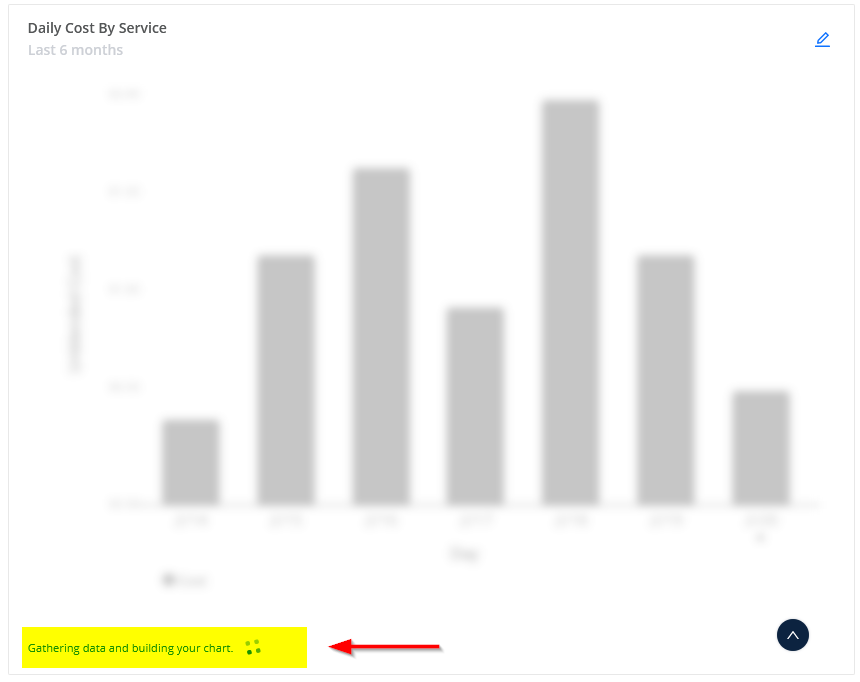
A new pane on the Home page and display a message indicating that it is building your new pane.
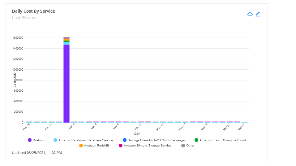
When the system is done building the pane, you will see your new visualization.
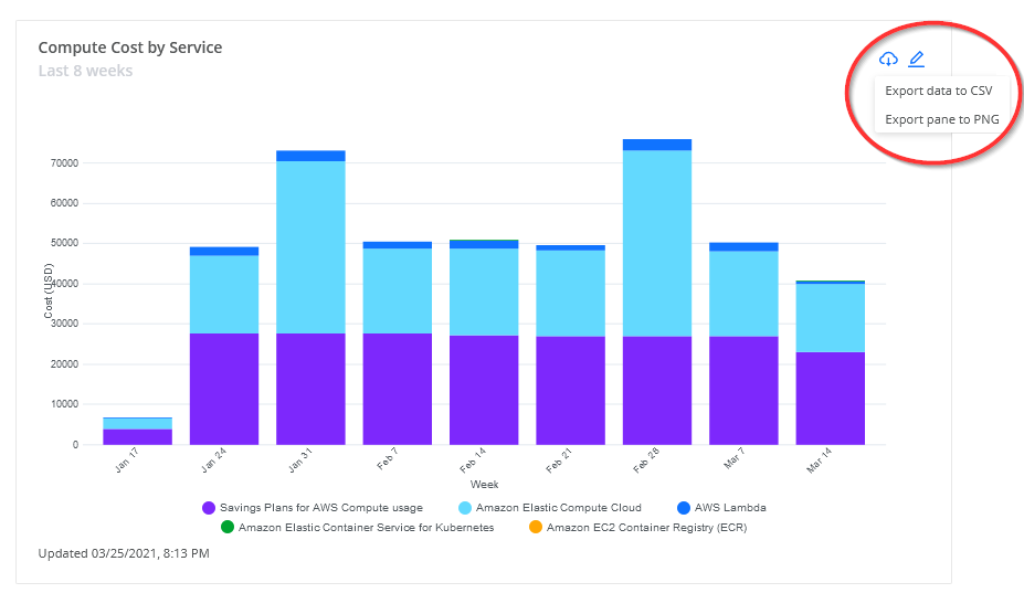
You can modify any of your dashboard panes by following these steps:
Click the Edit button in the pane you want to modify. The Edit Pane sub-drawer opens. For this example, let's edit the Daily Cost By Service pane we created in the first procedure:
Make any changes to your pane options and click SAVE.
You can also click DELETE to remove the pane from the Overview Dashboard. You cannot undo this action. You can also click CANCEL to leave the pane as you originally configured it and return to Overview Dashboard page.
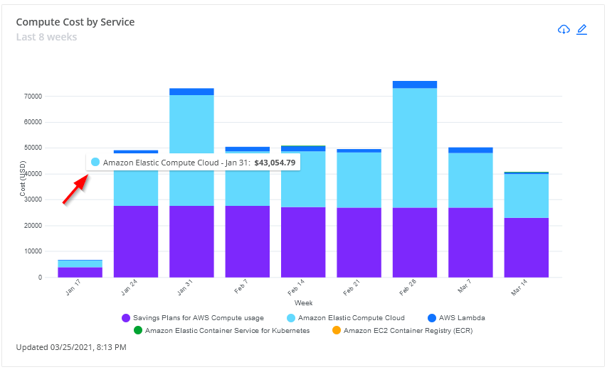
Pane visualizations allow you to focus on specific data points in your graph to see more details. Hover over any data point in your graph to view those specific details.
In this example, we pointed our cursor over the light blue section in the third stacked bar in this graph.
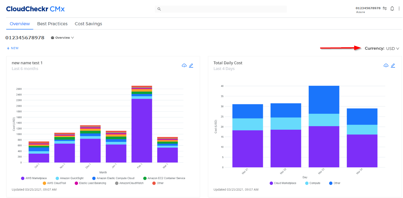
By default, dashboard panes display your cost data in US dollars (USD). This behavior is great if you only use AWS as your cloud provider since AWS books its costs in USD.
However, if you have Azure accounts that use different currencies, your queries won't produce any data and your pane will appear empty. To select the correct currency for your Azure cost data, we added a currency selector on the Home page for all Azure accounts.
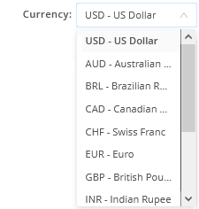
To select a different currency, click the drop-down arrow and select a currency from the menu:
Click Currencies to see a complete list of the currencies provided in this selector.
Country
Currency
United States
US Dollar (USD)
Australia
Australian Dollar (AUD)
Brazil
Brazilian Real (BRL)
Canada
Canadian Dollar (CAD)
Switzerland
Swiss Franc (CHF)
Europe
Euro (EU)
Great Britain
British Pound (GPB)
India
Indian Rupee (INR)
Japan
Japanese Yen (JPY)
Norway
Norwegian Krone (NOK)
New Zealand
New Zealand Dollar (NZD)
Sweden
Swedish Krona (SEK)
After you make a selection, the system will re-query according to your request and display the data in your dashboard pane.
CloudCheckr will retain the new currency selection in your account until you make another selection. For example, if you selected the British pound (GBP) in Account A, switch to Account B, and switch back to Account A, the data in Account A will still be displayed in GBP.
 in the pane you want to modify. The Edit Pane sub-drawer opens.
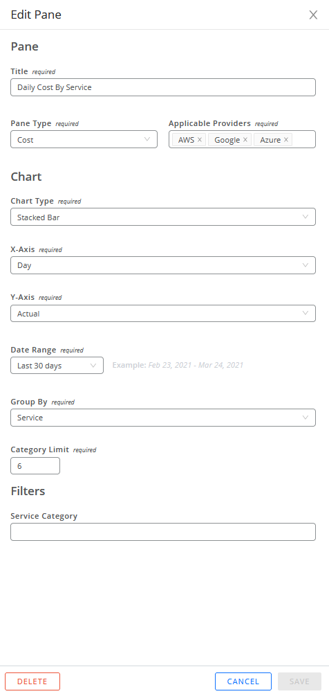
 in the pane whose data you want to export.